BLOGGER TEMPLATES AND TWITTER BACKGROUNDS »

Sunday 10 April 2011

Final magazine

Hey!
Sorry for the delay! My internet was recently cut off and all the libraries were shut! Luckily it came back today so that I can get marked. This is the very last post that I'll be posting. I hope you've enjoyed keeping up with my posts and seeing the news things I've learnt. Nevertheless the pictures for my final magazine will be posted below.

My evaluation of my magazine 'Word Up'

Hello!
Indeed this will be one of my last posts as this of course is this evaluation :(. Although I've had fun in making the magazine I've also experience some tough and stressful times along the way. Moving on though recently I was asked to make an evalutaion of my final media product. The presentation itself was quite sucessful as I was quite detailed and there wasn't any major screw ups or mistakes. However I'm going to add bits that I think weren't mention properly in the presentation so you could call this post 'exclusive'.


Slide 2: My main inspiration for my magazine was Vibe. I decided to use Vibe because they are a major company and are one of the leading magazines in Hip Hop. As you can see I have used many conventions from Vibe such airbrushing the graphic to get rid of spots, make the skin clear and to make the magazine have a professional look and the masthead. I spaced it out like Vibe because this meant that my magazine would have clarity and would be readable. I've also made my graphic pose in the same way because I generally like the pose as it connotes that the model is quite menacing and harsh and this is what I wanted my magazine to depict also. The model within my magazine had been cut down to a medium close up whereas the model on 'Vibe''s magaine is a mid long shot and I decided to have mine as a medium close up because it shows the emotions on the face better and the angle of gaze will be easier to view and see. Additionally I've made my model dress in black coincidentally the same as Vibe but nevertheless I chose black simply because it went along with the colour scheme and it also appealed to my audience as I believe this is the way most hip hop listeners dress. Unlike Vibe I've used a strapline (slogan) 'The No1 Hip Hop Mag' because I wanted to sum up what genre the magazine and what the content of the magazine was. Also I've used words like 'mag' and 'no1' because I wanted it to symbolise that my my mode of address is colloquial, modern and chatty. The genre of my magazine is female and male genders so I have used a female model to attract the males but I've also used a female so that   she would be aspirational to other females who want to get into the music industry. However I've used a universal colours to attract both gender's so that the magazine wouldn't connote feminism.

My magazine also includes:
Human Interest Stories - These will be stories that are quite melodramatic that are suppose to entice my audience in wanting to know more. I've added quite a couple for example:

These stories are usually real life and I assume that this can pass for a real life story.

Imagined Communities - This is where people feel a if they know the celebrities in real life so I believe that the artists shown above are well known celebrities and I know for a fact that their fans build a relationship with them so these artists being together would be big news within the Hip Hop industry.

Uses and Gratifications Theory - This implies that an individual may watch X factor to laugh at people who can't sing or act crazy on the show. My magazine includes this a little in a specific article which is:


Now I know some youth are based in my target audience only watch Awards and gigs to see people mess up for example someone mess up on a speech or if someone fell of stage so this is the reason why I embedded this into my magazine.


What did I learn?
This evaluation helped me to remember why I put certain things in my magazine and it helped me to back up my points and ideas for why I did some things different to real life magazines.

Advice and answers from a Media Teacher

Hello!
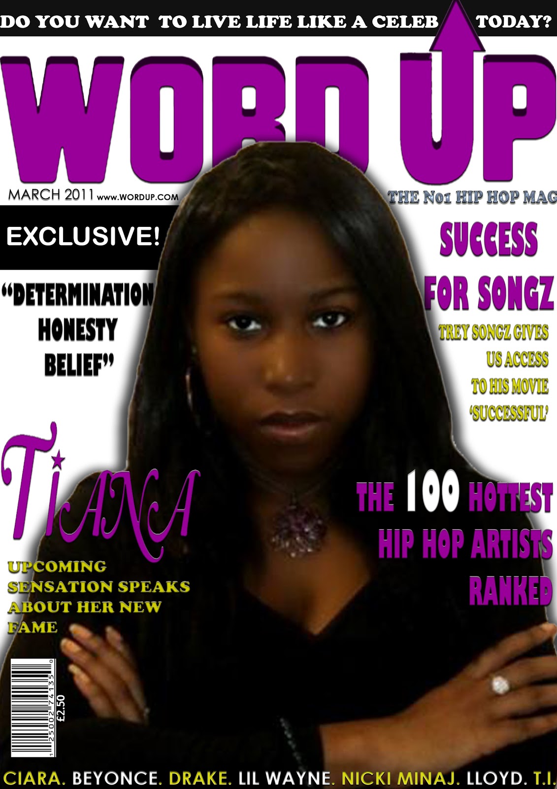
I decided to do my own research on how my magazine was depicted through the eyes of my audience. Furthemore the responses I've had back are positive and I will display the information with my evaluation. Nevertheless I've also had the pleasure of asking a media teacher what he felt about my work and what could be improved on. The information I've got back from the teacher has been valuable and had made me realise that my magazine is quite successful.

Question 1


I can understand why he said an R&B magazine because his interpretation is different from mine. Even though the magazine states that it is Hip Hop I asked him to avoid this and look at the magazine without the obvious. When I looked up the defintion of R&B and Hip Hop, google defintions stated:


R&B: A style of music developed by African Americans that combines blues and jazz


Hip Hop: A popular music style comprising elements of rap and soul


When I think about the artist associated with my magazine I believe that there are more closely associated with Hip Hop because the sounds they're producing are more of rap based rather than blues. Nevertheless I took his point into consideration and I believe that if I were to change the magazine to R&B then it would still have the same effect on the reader. Although originally on my flat plan it said 'the no1 hip hop and R&B mag' but I found this too wordy so instead I took out the 'R&B'.

Question 2


Not going to comment on this answer too much because as you can see the answer is a positive one. He even added a comment of 'it looks like a real mag' which is always a nice thing to see and it further lets me know that my magazine is quite successful.

Question 3


With this question he states that he liked the colours and the pictures mainly which was a surprise because I believed my images were not of a good quality however to have a teacher like them is actually uplifting. He also stated that the magazine had a 'great layout' and an 'use of codes and conventions'

Question 4


With this question he agreed that the price was good due to the amount of pages in my magazine. I never thought of it like this before but again this makes me believe that my magazine price was reasonable.


 Question 5


Again he agreed that my double page spread was entertaining. Even though he is not part of my target audience, this let's me know that my article can be enjoyed by other generations which is a bonus.

Question 6


The layout took me a lot of time to figure out because I wanted it to be conventional so to get the feedback that the layout was appealing and well planned is overwhelming. I'm very happy that it looked professional too.

Question 7


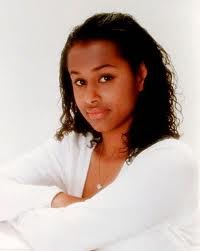
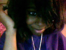
Now when I first gave him my magazine I wanted him to be critical and to be honest I believed so much could be improved with the magazine. However to know that it's just the images I needed to change is a good thing and if I was going to do the project again I would definitely get better quality of images.


Question 8


Due to the lack of time of classroom, I asked my teacher to fill out the questions on the computer hence why the quality is lower. Furthermore the question states "do the pictures shown reflect on the magazine and are they appropriate" he answered yes which makes me believe that my hard work has paid off and it's nice to know that the pictures have been appreciated and thought about.


Question 9


Again I apologise for the quality within the graphic. However the question says "do you think the objective for aiming the magazine towards 18-35 year olds was reached" and he replied with a yes so this let's me further know that my magazine was successful and that my target audience can enjoy the magazine.

Question 10 - No response.

What did I learn?
I learnt that my magazine is a success and that it could really be sold in the media industry.

Thursday 7 April 2011

Artist Inspiration for Word Up!

Hello!
I thought I should sum up my inspiration for my magazine as this helped me to create my final product which I deem to be quite successful.

My main artist inspiration for my magazine is....


KAYNE WEST


I chose Kayne West as my main artist inspiration for Word Up because of his attitude, his style and the way his music sounds. His attitude is more of a non caring and he says what he thinks which is what I try to depict this in my magazine however not to the point that it would deter people from reading the magazine. I think the look he gives in this specific photo is powerful and dominating and again I wanted this to be illustrated within my magazine especially on my front cover. His style is casual and again he doesn't care about what people think about his clothing or him generally as he is quite laidback. Nevertheless even though Kayne West seems harsh and rude on the outside he's got quite a bubbly personality and seems like a nice person once people get to know him better which I think I illustrated my model's bubbly and innocent side through the article on my double page spread. The way his music sounds always makes a huge impact on his audience as his songs can stay in a person's head for weeks. His latest song 'All of the lights' featuring Rihanna is quite a bold sound and uses a range of instruments to get his message across and in conclusion the song sounds unique compared to other songs displayed in the market today. So that you all get a real feel of this song I've embedded it below.


Kanye West - All Of The Lights ft. Rihanna, Kid Cudi


Criticisms: Magazine Competitions

Hello!
So I was just doing a bit of research on the internet when I discovered two magazines that made my heart sank with disappointment and made me just literally angry. These magazines were:


Now you can probably tell why I'm fuming and quite disappointed with myself really because I had no idea that these magazines existed. Obviously Word Up magazine has the name of my magazine and Rap up has my arrow idea that is included in my masthead. I'd like to think that I did do thorough research for my genre of magazine which may be the reason why these magazines didn't come up. However both magazines cater more towards the R&B audience whereas mine is more to a Hip Hop audience which is a positive. 

What did I learn?
Well the obvious being to research more on the internet so that predicaments like this can be avoided in future. Hopefully if my magazine went well and made some sales then I could in future change the name to something else which then I will be able to alert my fan base on places like twitter and facebook. Maybe I could even become partners with the magazines presented.

My double page spread analysis

Hello!
I wasn't originally going to make an analysis of my double page spread because I assumed that I would have to talk about one in my evaluation however I changed my mind because I wanted my work to be consistent. However I will try to make this presentation brief as I have noticed I do tend to write a bit too much and I know some people don't like reading a lot hence why I will try to shorten this presentation.


What did I learn?
I learnt that the double page spread was the hardest page to make so for next time if I was to make a magazine again I would cater more to the layout for the double page spread because mine wasn't the best even though I did try my absolute hardest.

My graphic justification

Hi!
While doing my research I discovered and evaluating my magazine I saw that I had not talked about my graphic places at the top left of my contents page much so I decided to dedicate a whole post to it. You'll find out all you need to know about my edited graphic in the presentation below.

I learnt that edited graphics look good within a magazine because on the whole it makes the magazine seem different. For example I didn't see Vibe or Hip Hop connection use this convention so this makes my magazine different and more thought out. Also mistakes can be good because as I stated before I was just messing around with the picture and then I accidentally filled it and it turn out to look good.

Tuesday 5 April 2011

My evaluation survey layout

Hi!
So I've been doing my own research for my magazine and I have come to the conclusion that I need to do another questionnaire but this time it will be about how people feel about my magazine, what could be improved on and on the whole, whether or not my magazine looks professional. Below I will show the layout of my survey:


I made the questions brief based on the fact that some questionnaires can be a bore and people of my target audience don't usually have a lot of free time. Nevertheless I did leave answer boxes for all questions because I believe that people do have opinions and sometimes they're opinions are not heard so I gave them space to express themselves if necessary.

In case the questions are hard to view I will display them below:
  1. What magazine genre do you think this magazine is?
  2. Would you buy this magazine if it was presented in a shop?
  3. What are the main features you like about the magazine? (skip this question if you do not like the way the magazine looks)
  4. Do you think paying £2.50 for this magazine is appropriate?
  5. Is the article on the double page spread entertaining and professionally, well written?
  6. Do you think that the magazine layout is well planned and appealing to you?
  7. What do you think can be improved about the magazine?
  8. Do the pictures shown reflect on the magazine and are they appropriate?
  9. Any comments or feedback that you want to say? Please write below:

What did I learn?
I learnt that making a questionnaire doesn't have to be full with detail because in the end the audience will only spend about 2 minutes answering it. Also making it brief means that my questionnaire gets straight to the point and does not waffle.

Thursday 31 March 2011

My Contents Page analysis

Hello!
Yes it's true, I can finally show you my final contents page! Sorry for the delay, I've had so many complications with the contents page itself and complications on this website however the main point is that I can finally show you! To be honest I believe my contents page is the weakest out of all my page but that doesn't mean that it doesn't have potential becaue I believe it does. My analysis of my front cover is shown below and I hope you like it.

What did I learn?
Doing this part of the project made me realise how important structure is for example how to lay out my columns and where to put my graphics. If I hadn't of structured my page properly then I don't think it would have been successful at all and it could have been extremely messy.

Wednesday 30 March 2011

The Tiana Interview!

Hey!
Finally I managed to get an interview with my artist Tiana; my apologies once again for the interview for being so late it's just I've had to work around my models and my artists schedules. Moving on the interview on the whole was successful and I do see most of the things said being put into my final magazine. The interview will be shown below and I think it has quite an entertaining and colliquial feel to it which is what I wanted.

Standfirst: Tiana Reeves has been topped the music charts across the world with her new single ‘Magic’. Can she do it again? We hold an exclusive interview with the stunning, sassy star and ask her personal questions including her life before fame, her inspirations and musical talents.


Welcome Tiana! We are delighted to have you here with us today! So tell us, what is it like to be a universal hit and to be called ‘The new face of Hip Hop’?
Ah thank you, it’s a pleasure to be here. And well, what can I say apart from it has been absolutely crazy but in a good way. I guess I never thought I’d become this huge so to get here so quickly is more than I ever expected. It’s something I couldn’t have imagined in my wildest dreams!
As for that new title, gosh it’s an honour! As I said, things are going so fast I didn’t believe I’d get such a strong title as that. However it’s a nice feeling to know that as an artist you’re appreciated and so are your songs. So being the new face of Hip Hop personally is truly special.

How wonderful! Sounds like you’re having an amazing experience. However taking that into account, when did you first start singing?I first started singing at the age of three when I was singing Whitney Houston’s ‘I Wanna Dance with
Somebody’ in my bathroom. I think it was a touching moment when I first sung because my mother started harmonising along with me and ever since then we just started to sing together which made our bond grow stronger.
                                                              
Quite a powerful song for someone as little as three! Along the way there must have been some artists  that  have inspired you to become who you are today. If so who are they?
I have three main music inspirations which I call my ‘Power Three’. These are: the fabulous Tina Turner, the always-determined Usher Raymond and the legendary Michael Jackson. These artists have been my
inspiration since they ever began because they are all so powerful on and off stage; they always do great performances. Hopefully one day I can be as powerful as them on stage and express myself freely like these artists do.

They have performed all over the world and in the most unlikely of places. Where would you most like to
perform?
Well I’ve always been a fan of the ‘Alan Carr: Chatty Man’ show so performing a single on there would be really good fun as the audience are friendly and the host is extremely welcoming so yeah I would love to be on that show. Even thinking about the possiblity of being there is very exciting!

Very reasonable as the show is extremely funny and amusing! There have been many collaborations on that show too such as Mariah Carey and Eminem performing there together. Who would you like to collaborate with in the future? Well because he’s one of my ‘Power Three’ I would love to collaborate with Usher in the future! He makes incredible songs that the audience adore and he just never fails to please. Making a single with him would be an extraordinary experience for me; I know it would be one of a kind.


We’re sure the song would be successful and remain in the charts for quite a long time. Being a new hit and taking over the music industry must mean that that you’ve got quite a lot of offers from guys?I’ve had a few and been on quite a few dates. However right now I’m trying to focus on the music side to things rather than my relationship status. Although that doesn’t mean that I’m a work-a-holic, I still maintain a social life and all. *Giggles* there is someone in mind that I would like to go out with in future as he is such an attractive person and he’s sociable however that will remain a secret for now!

Well missy you do seem to have such a secretive side to you! Moving on, do you play any instruments? Indeed I do *shyly looks away*. I play the flute which I know doesn’t go along with my image and I play the keyboard. I like playing the keyboard as this is how I start making new songs and it’s quite typical but I have a passion for playing the flute because of its distinct sound.

Wow the flute! Never would imagine you playing an instrument like that, but then again you are full of surprises. Do you think you’ll stick to doing Hip Hop or can you imagine yourself doing mix genres of music?Hip Hop is where my passion lies however I’m not afraid to try new things. So, if the public demand is for club dance music which is what is popular now then sure I’ll probably do a club dance hit. I know for a fact that I don’t see myself singing a rock tine anytime soon! I can’t sing rock tunes at all!

Good choice! Club dance is popular but hopefully Hip Gop will come back around! Although what do you believe the future holds for you - surprises perhaps?I believe that my future will be successful and that I will continue to make more successful singles that the public will find an interest in. To get a platinum album would be on the agenda too! *Giggles.*
We hope so too! Well thank you for participating in our mini interview, I hope you had fun and we wish you all the success for the future.
*Laughs* Thanks and yes I did.

Conclusion: Will she continue to take over the music charts in the near future and remain the new face of Hip Hop? She’s currently working on her first album ‘Magic’ which will hit the stores in June 2011 so make sure you buy yourselves a copy!
What did I learn?
Preparing questions really helped when doing an interview because it made me feel more organised and also the way I structed the questions made it flow and sound natural which is what I wanted it to be like.

Tuesday 29 March 2011

Picnik - A brief explanation

Hello!
As I mentioned before, this week I am going to post loads of posts to make up for the time that I haven't been posting. However the topic of this post is the editing website picnik which specifically made to help make photos look professional and by having fun in changing the way a photo looks. Below will show a brief presentaition in which I used this website to change the way I wanted a photo to look:

Editing Using the Software Picnik


What did I learn?
I learnt the many different techniques and effects that I can use for future photos and even past ones such as the Tiana shoot photos.

New Pictures

Hello!
APOLOGIES! Once again I've been so caught up with the designing aspect of things that I have simply lost track of time. But don't worry; for the entire this week be prepared to be bombarded with posts from me about what I have been getting up too!

Moving on to fill you in there have been many changes, new things added and improvements that I have applied to my magazine. For example:
  • Changed the Front Cover
  • Almost finished the Contents page
  • Finished the double page spread however I'm debating whether or not I have to change some features
Now I know that seems like I'm almost finished but I haven't forgotten to print screen things that I have been doing. This being done so that you can visually see what I have been getting up to and pictures are always a nice touch.

However this post specifically is to show some more photos that I have taken for my magazine in which these photos are all for my contents page.


 These photos were taken with the use of desk lamps, natural lighting and no flash. Due to the schedule of the model I only had time to take three main photos as the rest of the photos were to an unprofessional standard or blurry. Even though there were many problems with this photoshoot I believe these three photos were successful and I'm glad that I managed to take photos that look good and are of a professional quality. Although these weren't the original photos as I have editied the photos slightly on Photoshop Cs3 and the photo editing site 'Picnik. As mentioned before these photos will probably go into my double page spread and if I had to use one of the three photos I took I would use the first image as I think this ties into my articles more.


This is the same model that I used above. Again due to her busy schedule I wasn't able to take many photos of a professional standard. It was a relief to find her in suitable clothing and a setting appropraite to my magazine. The background was used by simply putting white sheets around the environment to cover up the messy surroundings. On the whole I believe that this photo is successful as I like the pose and the emotion shown on her face. Additonally when I edit this on Photoshop CS3 it would be easy to get a smooth finish around her body structure. Althought if i were to take this shot again then I would remind her that she isn't wearing any shoes which I totally didn't realise when taking the shots.


For this photoshoot it was taken inside the school sixth form. Originally I started my flat plan with including a boy inside it because it's aimed towards males and females. However I then decided to scrap including a guy within the magazine because I believed that I wouldn't be able to get hold of one. Time went by and I realised that my magazine was becoming female dominated so I decided to arrange a photo shoot time and place and I quickly took some photos. I believed I thought about the mise-en-scene because the background is white and so when I edit the photo it won't be hard to do. On the whole I believe this photoshoot was successful and I managed to take a variety of photos that would all apply to my magazine. Although if I were to choose only one image it would be the image located on the right because I think that it would be easier to place on my contents page and it's a good size to work with.

What did I learn?
I learnt that the mise-en-scene really impacts the way the final photo will look for example looking at these photos in comparison to the photos I took for the 'Tiana' shoot I realised that those photos are not as professional and sometime in the future I may have to go back. I've also learnt to look at every aspect of the model before taking the photo for example making sure the model is wearing shoes or that everything is in the right place.

Wednesday 16 March 2011

Tools I have used

Hello!
Since I didn't print screen along the way I decided to make up for it by showing you all the tools I used on Photoshop CS3 and by showing brief examples of the tools.


What did I learn?
I learnt most of the many tools displayed in Photoshop CS3 and how to use these tools effectively when working on my magazine.

Tuesday 15 March 2011

My Finished Front Cover

Hello!
I have finished my front cover! It took a lot of effort and work but in the end I prevailed! This mini presentation will show you the main things that I have changed from my flat plan to my front cover and the steps I took to get to my final product. I hope you like it and please do remember that my magazine is aimed towards 18-35 year olds and the genre is Hip Hop.

(In case the picture of my front cover is shown smaller and not good quality I have embedded a photo of it below.)


What did I learn?
I learnt how to use Photoshop CS3 properly as that was the editing software I used to create my magazine (I'll go into the tools I used in future presentations) and I learnt that even though you have a flat plan there are things that you'll inevitably want to change and if that's the case there's no need to get stressed about it.

Tuesday 8 March 2011

Front Cover so far

Hi!
Recently I've been working on the front cover of my magazine using the software 'Adobe Photoshop CS3'. So far using this software has been stressful as sometimes things don't go the way you want it to. However I've been trying my hardest to make the magazine look of a professional standard and conventional. Additionally to be nice I've also attached how my magazine looks so far which is presented below.


Overall I'm quite happy with what it is looks like so far because I like the colour scheme and I believe it was good; how I stuck to flat plan. However there is much more that needs to be done and much improvement for example the artist's name needs to be bigger and there needs to be more range in fonts.


What did I Learn?
I learnt how to create a masthead and change the colour by using cropping and highlighting tools and I also know how to put into text and change the colour of my text by using the text and hightlighting tools.

Photo Shots Part One

Hello!
Sorry for the delay! My internet connection has been running wild for the entire week! Moving on last week Tuesday at 6pm I took photos for my magazine. The photos that I have specifically taken are for my front cover and my double page spread. Overall being a photographer for the period of time I had was a great experience and I thoroughly enjoyed it. The model posed as the celebrity singer 'Tiana' and I shall embed some photos I took with this post.


What did I learn?
I learnt that putting the model in front of a faded or white background will help much more in the editing process and once again save time. Also to always take the date off when taking picturs for my function as now I will have to spend more time editing the photo.

Monday 28 February 2011

Interview questions for my artist *Tiana*

Hello!

As part of my music magazine my teacher assigned me with a task to create interview questions for my interview with the feature artist of magazine which will be presented on the Double Page Spread. I believe doing an interview with the artist will be effective for the audience because the audience can form a closer relationship with the artist and can have an incite to what really goes on in the artists lives. Nevertheless I shall display the questions that I will ask my artist *Tiana* below however these are not concrete and may be considered as a rough plan to what might actually happen when the interview commences. Additionally the interview will take place sometime during this week depending on the schedule of the artist but preferably on Tuesday 1st March, 7pm at the artists house as I'm quite sure this would be good location, time and date for her.
  1. What is it like to be a universal hit and to be called ‘ the new face of R&B’?
  2. When did you first start singing?
  3. Who are your musical inspirations and why these artists in particular?
  4. Do you only listen to R&B artists or does your taste in genre vary?
  5. Where would be the most entertaining place for you to perform? 
  6. Who would you like to collaborate with in future?
  7. Do you play any instruments?
  8. What do you believe the future holds for you?
I chose these questions in particular because they are all about her and I believe the audience would want to know who this artist is, a bit about her what we can expect in future from this artist. Additionally in research some R&B magazines have serious and boring articles that the reader loose interest of and I don't want my article to do that; I want it to show that R&B doesn't have to be serious all the time and that the artists involved do have friendlier sides to them. I've only chosen 8 because the questions are only going to be shown on one side of the double page spread not the full two so i have less information to show and potentially I may pretend that the article would carry on the next page which would make sense.

What did I learn?
Constructing the right questions is hard work because you want the questions to be effective but you also want the reader to retain interest in what is being said by the artist. I just hope that the interview will go to plan and that there aren't any major problems.

Camera Shot List- The Plan

Hello!
Again I was set a task to write about all my shots that I have shown within my magazine. Hopefully having this plan with me whilst doing the shots this would make matters go smoother and quicker and I would finish off with a detailed and thought about shots.

Here is the final plan below:

Front Cover:


Contents:


Double Page Spread:


What did I learn?
I learnt that making plans actually makes things easier so in future I'm going to make plans for other work (since I'm not usually that type of person) because now I know I will benefit from them and it would make my life much easier.

Friday 25 February 2011

My Double Page Spread: Analysis

Hey!
During the holidays I was set an assignment to evaluate the final part to my analysis trilogy: my double page spread. All in all creating the double page spread was the most difficult page to design out of the three because I need it to look interesting and appealing to my audience as this article is the main one as it's on the front cover. Below shows my analysis of the double page:

MY DOUBLE PAGE SPREAD

What did I learn?
I learnt that in order for my magazine to be successful it has to have the element of continuity as otherwise the magazine will look messy. I also need typical conventions so that my magazine gets treated like main professional music magazines.

Saturday 19 February 2011

My Music Magazine Front Cover Flat Plan: Analysis

Hello!
Recently I was set an assignment to make a contents page for my magazine. Overall I think the result was quite successful and I referred a lot to what the conventions of  professional magazines looked like such as 'Hip Hop Connection' and 'Hip Hop Weekly'.

N.B. For your viewing pleasure please view this in full screen (Menu>Fullscreen) as I wasn't aware that my font would show up incredibly small on SlideShare.


What did I Learn?
I learnt that the colour scheme really attracts the audience and can even change the audience's mood. Also that I will need to space out everything so that all my conventions and information fit but also to the point that there aren't too many gaps and spaces as this will look unprofessional and messy.

Contents analysis

Hey!
APOLOGIES! I honestly thought that I had done this blog already and was generally surprised to see that I hadn't but nevertheless everything is prepared which is good! Moving on I was asked to do an analysis on the contents pages for my magazines 'Hip Hop Connection' and 'Hip Hop Weekly' to carry on my research. I discovered new conventions and all in all it made me think about how to present things in my magazine.

N.B. Please view this in full screen (Menu>Fullscreen)as I didn't realise that the text was so small.

Contents analysis

What did I Learn?
I learnt that I have to keep the audience interetsed in the magazine> To do this many things have to be considered like the graphics and even language used. I've also realised that I want my magazine to be quite funny so that the reader can be entertained.

Thursday 17 February 2011

My Music Magazine Front Cover Flat Plan: Analysis

Hi!
In the next stage of our assignment we were ask to design a flat plan which would be what we refer to for our magazine. In order to make the flat plan look professional I was asked to look at the conventions for other music magazines that refer to my genre these being my original magazines of study (‘Hip Hop Connection’, ‘Hip Hop Weekly’ and 'VIBE'). Additionally I took into consideration my market research, what my target audience wanted although not all of their wishes could be fulfilled as I will explain later. I shall present my work as a PowerPoint.


N.B. The text may be jarring to eye when viewed small so for your viewing pleasure please view this in full screen.
FRONT COVER


What did I Learn?
I learnt that designing a front cover is hard work and I have now an appreciation for what the magazine industry do because when you design a magazine you have to think about how the conventions will look together and how to tie everything in so for them to do that every month/week is a tough task but they do it successfully. Also I've realised that making a flat plan to refer to when making my magazine was a good thing to do because I've had time to think about what my magazine will look like instead of rushing everything which would make the magazine look messy and unprofessional.

Wednesday 9 February 2011

Music Magazine Cover Analysis

Hello!
Recently I was asked to evaluate two magazines that fit the genre of magazine that I'm going to make in future. I decided to start this task by ripping out the front pages for my magazine, then sticking them onto A3 and annotating around the magazine. To finish off the work that I did I was then ask to write a summary about my finding which is what I did below:

What did I learn?
I learnt that I need magazine to attract my audience and this must be one of the things that I have to remember to focus on. To do this I shall think about the colour schemes and what sort of stories I will include within my magazine so that it would attract my specific target audience.

Monday 7 February 2011

Double Page Spread

Hi!
Following on from the music magazine cover analysis I was then ask to analyse two double page spreads from different magazines. The magazines I chose to analyse was 'Hip Hop Connection' and 'Hip Hop Weekly'. From these double page spreads I saw there was many characteristics to analyse individually and during this I shall go into more depth of analysing.

What did I learn?
I learnt that the double page spread has to be consistent with the front cover as if it isn't then this could leave the audience confused and all in all this it wouldn't be professional to not have it consistent.
Hip Hop Connection:
  • Man on the left (Phonte) - straight face to show power and dominance. This could alo show that he is the more serious one out of the two celebrities presented.
  • Background - dark, this is maybe done to show the dark side of the celebrities
  • Lighting - lots have been used on the faces so that they stand out from the background and so that their faces are the main focus
  • Graphic spreads across both pages
  • Clothing - relates back to the context of the magazine. The look of the two celebrities is to look casual hence why they are wearing hoodies and coats.
  • Angle of gaze is towards the audience
  • Page is male dominanted: graphic, font and language
  • In a room - could show that these celebrities don't care where they are which conveys the typical 'bad boy' 'gangster' attitude that most Hip Hop male artists have
  • Man on the right (Big Pooh) - slight smile to show that he is the nicer or minor celebrity out of the two as he doesn't show dominance like Phonte.
  • 'THE WAY YOU DO IT' - Colour relates back to front cover (white) which again means that the magazine is consistent as the colour white has been used throughout
  • 'ARE YOU AN EMCEE CAUGHT AT A CAREER CROSSROADS?' - Rhetorical question as Phonte and Big Pooh are still going to answer the question regardless of the answer of the audience. This is also in the colour red which signfies dominance and persuasion. This is also harsh as this magazine is male dominanted.
  • Dropcase on the 'H' so that the article looks more interesting
  • 'Fruitless fling' shows alliteration which makes the articles more entertaining to read
  • 'Who better then to offer career advice to an assortment of hip-hop types looking to make that next career-defining move? - rhetorical question so that the audience to become more engaged in the article and indulge in the article more.
Hip Hop Weekly:
  • Dropcase - letter of the 'y' which is blue contrast to the other colours
  • Questions are in red and answers are in black so that the reader can follow along with the article
  • Big bold title 'T-STREETS' to have continual of colour scheme but to show the boldness of the artist
  • (T-STREETS background in graphic) Surroundings - in a room which symbolises how rappers usually start their music dreams in a bedroom or a room within their house. 
  • (T-STREETS and SHORT DAWG graphic)  Standfirst- copy is white to stand out from the dark background. Runs over image which is usual and interesting effect.
  • (T-STREETS graphic) angle of gaze is towards the audience
  • Colour Schemes - blues, browns, red, blacks and white - although there are a range of colours they all seem to tie in together a some colours are bolder than others. However the new shades of brown are a new feature which is unconventional as the front cover does not consist of any browns.
  • (SHORT DAWG graphic) angle of gaze towards the audience and the camera shot is a long to show full body posture and expression of face. The attitude and the expression of the face shows a dominant attitude.
  • (SHORT DAWG graphic) clear graphic background and quite natural surroundings

Sunday 30 January 2011

Reader Profile

Hello!
Based on the questionnaire results I can now create a reader profile. I believe the reader profile will be the foundation to my project as it would provide me with the objectives that I have to accomplish. Also with this detailed reader profile, if i stick to it then I believe that my magazine would become successful as it would relate to the personalities of the public. Below I shall now show all of you the completed reader profile for my magazine.
Reader Profile

Chantelle is a sixteen year old girl that attends a public college as she feels more of herself there. She loves music so with this in mind she plays the violin and sings with in the college band. However she usually listens to R & B and Hip Hop as she feels the lyrics usually associated in this genre are fun and entertaining to sing. She aslo believes that R & B amns Hip Hop is more easier to sing so therefore doesn't feel under pressure to push her voice much.
Baring this is mind if she were to buy a magazine then it would be a R & B/ Hip Hop/ Rap magazine as she feels the stories within the magazine would be to her taste and she would enjoy them more. The stories included within a magazine is the best part for her as she can sometimes relate to the articles and finds them intriguing to reader.
Her favourite artists include Beyonce, Nicki Minaj, Usher, Drake and Lil Wayne as she feels these artists particulary express their emotions through the music they sing, are amazing in live concerts and put a large amount of passion in the work they do. The price on a magazine would deter her from buying a magazine because she doesn't receive much income so having a magazine that is too costly would put her off from buying a music magazine. Taking this into account the prepared amount Chantelle would pay for a music magazine would be in the range of £1.01-£2.99 since she doesn't buy magazine regularly  but she believes that if the content of the magazine was to her taste then this would be the desired amount for her to pay.
From her experiences of buying music magazines in the past she feels that there could be more freebies as she feel as if they are a nice added touch to magazines and believes that people of her generation would buy magazines more if they consisted of freebies. The freebies that would attract her the most would be a free CD however if freebie is not a CD then this wouldn't be a problem at all. She believes that bold colours would attract her to a magazine which could consist of colours like black, blue red and purple as she's a sort of person that believes bold colours could possibly make the magazine look more entertaining and interesting. For her having a magazine that included more articles about a specific topic rather than loads of pictures of celebrities would not be off putting as she likes reading the articles presented in magazines. Her hobbies include singing, dancing, socialising which consists of going out with friends which she does on a regular basis. Her interests include photography and sociology.